615 Boren Avenue
Seattle, WA, 98104
(206) 419-1916
Your Custom Text Here
Your Custom Text Here
Working at New York Magazine in the 1980's was a fantastic way to get a chance to design for every kind of piece. News, fashion, interior design, food, entertainment. You name it, we did it. And on a weekly schedule. You had no time to fix things, you needed to hit your mark immediately.
A great news story, with wonderful illustration by the late Julian Allen.
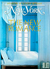
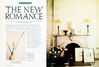
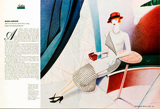
Marlilyn Bethany was a wonderful editor, and I was able to work with her on a number on interior design stories.
Oberto Gili took these photographs, and they pretty much designed themselves. All great photography tells the designer what to do.
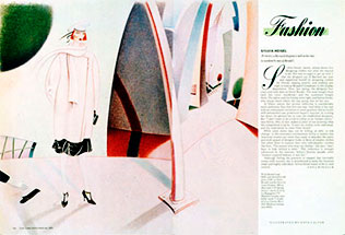
Anna Wintour was the fashion editor, and her remarkable style and leadership really pushed the fashion pages at New York Magazine. She was an inspiration.
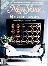
Marilyn Bethany again. Gorgeous photos.
Marilyn Bethany again.
Anna Wintour is one of the few fashion editors I know who really appreciates great illustration. She let Dave Calver just go to town with these two spreads. Dave is one of my favorite illustrators. He's fun to work with and he always delivers spectacular work.
More Dave Calver for Anna Wintour at New York Magazine.
Newsweek Magazine was my second weekly magazine. It's a pace that agrees with me, and I worked with wonderful editors and designers. It could be a little scary, when you were creating a new cover for breaking news, but it really exercised your design muscles. You needed to come up with a great concept for the covers, and fast.
Barbara Kruger, whose work was really getting a lot of exposure at the time, was someone we thought could really bring power to a difficult cover subject. I think she nailed it.
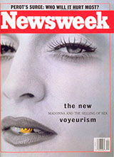
Steven Meisel took this photo of Madonna. He did the shoot, and just sent us this photo. I agree with him totally. It's perfect.
Ross Perot was really in the news, and the late Julian Allen did a great job of conveying the complexity and mystery of the man.
This s a wonderful hand-tinted photo of Elvis. I can't remember the photographer or the artist who hand-colored it, but it's always been one of my favorite covers.
Another instance where strong typography and a gripping image really pop on the newsstand. Which at the time was an important consideration. But even now, as a thumbnail, it is a powerful cover.
This was a tough one. But illustrator Terry Allen gave us this beautiful solution.
A heartbreaking photo and a simple line of text. That's all you need.
Again, strong typography is always the answer for me.
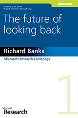
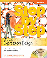
Microsoft Press was a new experience for me. Dealing with software and technology, the covers we did for various lines of books were fun and challenging projects. Here are some of the covers I designed/and or/art directed while at Microsoft Press.
Branding and identity work is one of my favorite areas. I've long been working for companies with legacy brands such as New York Magazine, Newsweek, and Microsoft. But it's really rewarding to create an identity for a new company, or to really develop and evolve an existing brand that needs guidance in their evolution and extension. CRI Rowing and Neighborhood House are great examples of this type of client.
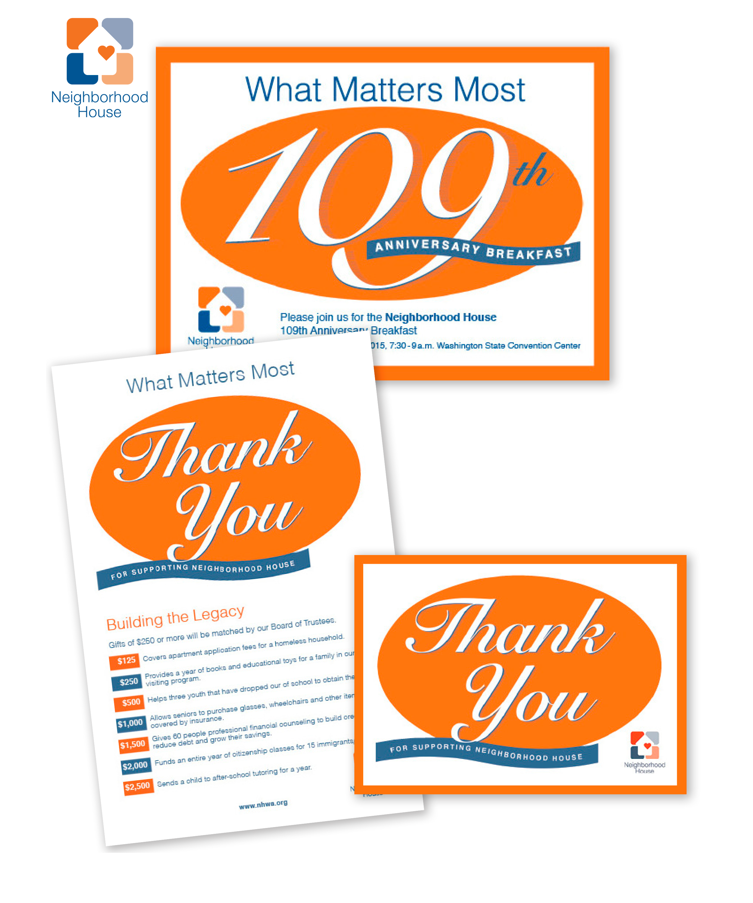
Neighborhood House is my favorite non-profit in the Seattle area, and I do pro-bono work for them throughout the year. These pieces are for their annual fundraising breakfast. This event include save the date cards, invitations, programs for the event and thank you notes to send after the event.
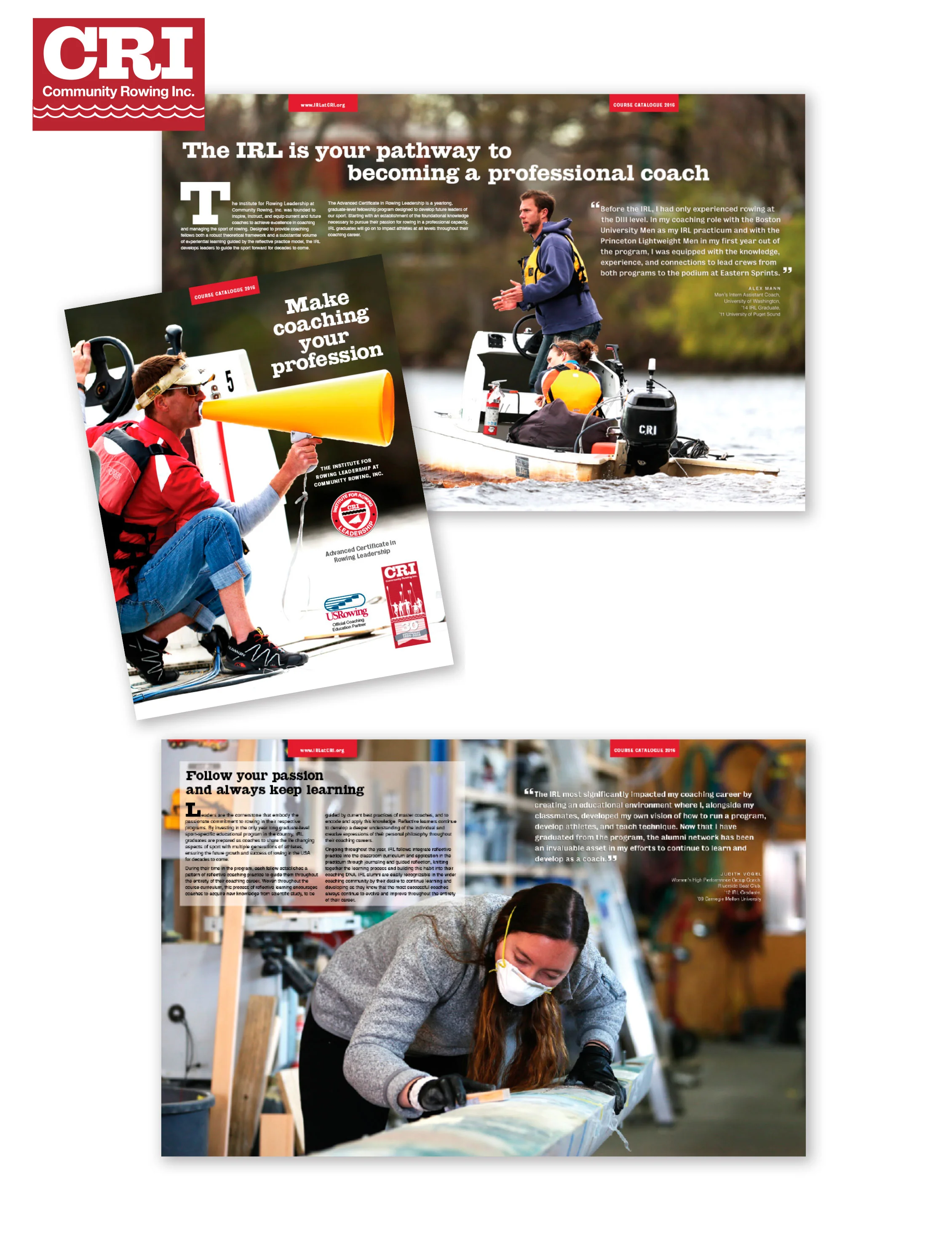
This is the cover and and a couple of interior spread for CRI's Annual Rowing Leadership program. Great photos to work with and a great client. They provide not only coaching training, but access to the sport of rowing, for everyone in the Boston Area. They also do a great deal of outreach to the Boston Public Schools. It's a great club and I've had the privilege of working with them on other projects as well.
This is a young America woman's company, based in London. She does make the best cookies. Her mother did the little illustration of the spoon and whisk. Perfect for this.
The brand in action.
For a friend, the double W's. Fun Strong and simple. And fun to design.
This is a design for a small publishing company in Seattle.
I'm a book lover, and my home is filled with books. Designing them is always a thrill. There is just nothing like leafing through a book, feeling the paper and smelling the ink.
Sam Abell took these amazing photographs. It was a dream to design a book with this caliber of photography.
This is the cover for the book, a wonderful group of photos from the 1988 presidential campaign, taken by Arthur Grace.
This is a cover comp for a short story, "In God's Waiting Room". It's a funny, quirky piece. It's always fun to get a chance to design for this kind of piece.
Marketing projects are everything from annual reports to data sheets, posters and postcards. I love creating families of marketing pieces for companies.
It was always interesting to create marketing pieces that really nailed the Microsoft corporate brand and also the identity of Microsoft Press. Keeping the two in synch was tricky, but fun.
This was a fun project, that let us echo the corporate brand while stepping just a hair out of that and developing our Microsoft Press look and feel.
A small start-up that I worked for had a logo and tagline, but needed the visuals to go with it. This was a great project, and the client was very interested in pushing the envelope.
This rowing club in Boston has a tagline of "Rowing for everyone". And they mean it. From para-rowing to rowing for veterans and Boston school kids, this organization really delivers a great experience to the community. And rowing is such a visual sport. It's a honor to design their annual report.
One project close to my heart is a 5 x 2.5 foot blackboard menu I created for a close friend's daughter's wedding. I love doing these and plan to continue with others in the near future.